Don’t Send Visitors to Your Facebook Wall!
Don’t Send Visitors to Your Facebook Wall!
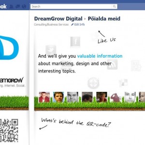
 Create a Facebook landing page for your brand. One of the most important things you need to do when creating your brand’s Facebook page is the landing page. Do not send people on the wall! I was doing research on Facebook and trying to find a bunch of brand pages. I found some and wasn’t really certain about the others. I was in a real hurry to finish this task. When looking at dozens of pages in a row you tend to notice where the time goes.
Number one annoyance was the fact that when you land on the wall you don’t understand immediately where you are. Is it a page created by fans, employees or some random guy who just created a placeholder. The brands with a landing page stood out. Make people understand that this is the right pace, the official page.
Second, I noticed that many large brands haven’t registered their username (you can do it here www.facebook.com/username) so that their page addresses are unpronounceable strings of numbers and letters. Not very trustworthy! When I see addresses like facebook.com/dreamgrow,facebook.com/coca-cola and facebook.com/microsoft, I subconsciously assume that these are the official pages. (tip: you can use even shorter address fb.com/dreamgrow)
Even if you don’t have anything else create a landing tab for your Facebook page!
Facebook landing tab should answer two questions:
- Where am I?
- What can I do here?
- Why should I click “like”?
It is really easy thing to do. Here are some tips that you should consider when making a Facebook landing tab 5 Tips to Improve Your Facebook Landing Page. And here are some free tools to do it with 4 Free Facebook Landing Page Creation Tools.
Now please go and do that. Be sure to change the landing tab for non-fans to correct page.
Related Posts


No Comment